
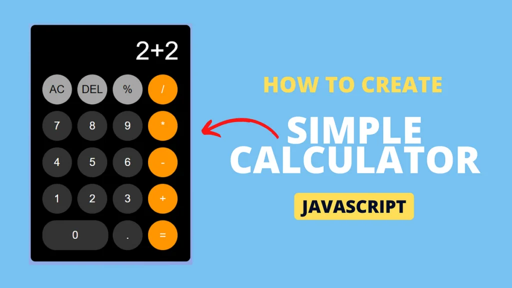
Introduction to Web Development
Web development is a multifaceted field that involves creating websites and applications for the internet. It can be broadly categorized into two main areas: front-end and back-end development. In this section, we will focus primarily on front-end technologies, which are essential for building the user interface of web applications.
At the core of front-end development are three primary technologies: HTML, CSS, and JavaScript. HTML, or Hypertext Markup Language, serves as the foundational structure for web pages. It allows developers to organize content using elements like headings, paragraphs, and links. CSS, or Cascading Style Sheets, builds on this by enabling developers to style and layout web pages. It controls aspects such as colors, fonts, and formatting, thereby enhancing the aesthetic appeal of the application.
JavaScript is the third pillar of front-end development, functioning as the programming language that brings interactivity and dynamic behavior to web applications. By allowing developers to manipulate the Document Object Model (DOM), JavaScript facilitates real-time updates and user interactions. In the context of building a simple calculator app, JavaScript will handle user inputs and perform calculations, making the app interactive and functional.
The significance of these technologies cannot be overstated, as they collectively empower developers to create seamless user experiences. Developing a simple calculator app, for instance, showcases the interplay between HTML, CSS, and JavaScript. HTML lays the groundwork for the app’s structure, CSS styles it to provide an appealing look, and JavaScript adds the functional logic for computations. Understanding how these three languages work together is crucial for anyone looking to venture into web development and create interactive applications.
Setting Up the HTML Structure
When embarking on the task of creating a simple calculator app, the initial step is to establish a robust HTML structure. The layout will serve as the foundation for the application, providing a clear and intuitive interface for users. In this case, the primary HTML elements will include buttons for the numbers and operations, an input field that displays the results, and a form to group these elements logically.
To initiate the process, one should begin with a <form> tag that will encapsulate the calculator’s components. This form not only organizes the elements but also provides an appropriate context for user input. Inside the form, an <input> field should be employed to display the current calculation or result. To ensure accessibility, it is wise to include attributes like aria-label for screen readers, enhancing usability for individuals who rely on assistive technologies.
Next, the addition of buttons is paramount. Each button can be created using the <button> tag, allowing users to select numbers (0-9) and operations (addition, subtraction, multiplication, and division). For semantic clarity, the type="button" attribute can be incorporated to prevent these buttons from submitting the form inadvertently. Implementing a consistent naming convention for button IDs and classes will facilitate easier styling and JavaScript functionality later on.
In terms of best practices, it is important to ensure that all elements are properly labeled and that any visual cues are functional and understandable. This could involve adding tooltips for button operations or using contrasting colors to clearly differentiate between number and operation buttons. The structure of the HTML is not merely about aesthetic arrangement, but significantly influences user interaction and experience. By laying a strong foundation with well-structured HTML, the subsequent layers of CSS and JavaScript will naturally enhance the functionality of the calculator app.
Styling with CSS
Styling a calculator app using CSS is essential for creating a visually appealing and usable interface. The fundamental techniques involve applying colors, managing layouts, and adhering to responsive design principles. By utilizing CSS, developers can enhance the overall user experience while interacting with the app. One of the first steps in styling a calculator is to choose a color palette that complements the app’s purpose. This palette should be applied to various elements, such as buttons and backgrounds, ensuring they are visually distinct yet harmonious and user-friendly.
Layout management is equally important, and developers can choose between CSS Flexbox and Grid for providing an organized structure. Flexbox is particularly useful for arranging elements in a single dimension – either row or column – allowing for easy alignment and distribution of space. This is beneficial when positioning buttons in a calculator layout, as it enables the creation of a clean and modern look. On the other hand, CSS Grid allows for a two-dimensional layout, which can be advantageous if the design calls for more complexity, enabling rows and columns to be easily defined.
In addition to layout methods, incorporating responsive design principles ensures that the calculator app functions seamlessly across different devices and screen sizes. Media queries are a key feature of CSS that can adjust styles based on the viewport dimensions. By using these queries, the app can maintain usability and aesthetics on both mobile and desktop platforms. This approach not only attracts users but also keeps them engaged with a consistent experience, making it essential for app development. By employing these CSS techniques, developers can create a functioning calculator app that is both effective and visually striking.
Implementing Functionality with JavaScript
To create a fully functional calculator app, JavaScript plays a pivotal role in managing user interactions and performing arithmetic operations. The first step involves defining the basic arithmetic functions: addition, subtraction, multiplication, and division. Each function should accept two parameters, representing the numbers to be calculated, and return the result. Here’s a quick example of an addition function:
function add(num1, num2) { return num1 + num2;}
Once these functions are established, the next step is to handle user inputs effectively. This can be accomplished by adding event listeners to the buttons within the calculator interface. Each button should capture the number or operator it represents, and push this value into a temporary storage system, typically an array. An event listener might look like this:
document.getElementById('addButton').addEventListener('click', function() { // Capture and store input});
The dynamic display of results is crucial for a seamless user experience. After calculating the result based on user input and the chosen arithmetic function, this result should be presented in a specific area of the user interface. Utilizing the Document Object Model (DOM), we can manipulate the HTML to update the display area:
document.getElementById('resultDisplay').innerText = result;
Handling errors is another vital aspect to ensure the calculator operates smoothly. This can include checking for division by zero or ensuring that the input is valid numeric data. Implementing simple error handling functions will provide feedback to users about what went wrong, thus avoiding confusion and enhancing usability.
By integrating these JavaScript elements, the functionality of the calculator not only becomes possible but also ensures that users have an interactive and engaging experience. The interplay between JavaScript logic, HTML structure, and CSS design culminates in a cohesive calculator application.